Charts
Bars, sparklines, gauges, line plots and scatter — at sub-cell resolution
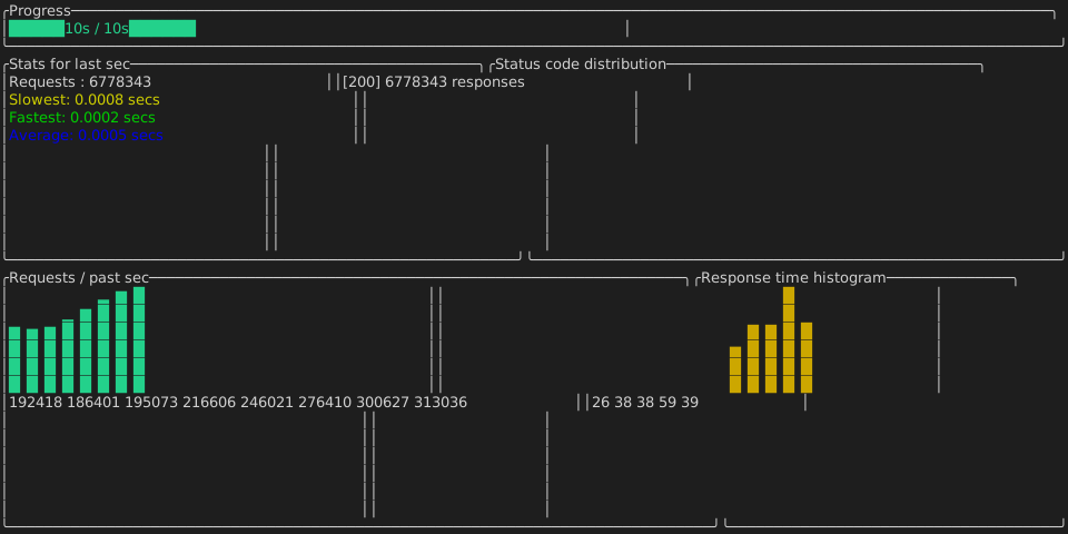
Sub-cell resolution
A terminal cell is a coarse pixel, so the charts cheat two ways:
- Eighth blocks (
▁▂▃▄▅▆▇█) give bars and sparklines 8 vertical steps per row. - Braille (
⠀–⣿) packs a 2×4 dot matrix into a single cell, so line and scatter plots get 8× the resolution of the character grid.
The cell primitives live in @uniview/tui-core (verticalBarColumn, SubcellCanvas). Each
public binding includes the chart implementation and exports the same React or Solid chart
components, so a terminal app needs only its chosen binding.
That is why the components are thin: they are createMemo/useMemo wrappers over the same
builder, which is what makes a chart render identically in both frameworks.
The six
<BarChart data={[{ label: "a", value: 12 }, { label: "b", value: 30 }]} />
<Histogram values={latencies} options={{ bins: 12 }} />
<Sparkline values={scoreHistory} options={{ max: 100 }} />
<Gauge fraction={elapsed / total} options={{ width: 40 }} />
<LineChart series={[{ points: [[0, 0], [1, 4], [2, 3]] }]} options={{ width: 60, height: 12 }} />
<Scatter series={[{ points: samples }]} options={{ width: 60, height: 12 }} />
Use the public components
Import chart components from your binding. The same example works with
@uniview/tui-solid by changing the import.
import { Sparkline } from "@uniview/tui-react";

return <Sparkline values={values} options={{ max: 8 }} />;
The lower-level chart builders are implementation details of the bindings; they are not a separate consumer dependency.
Sparkline draws one glyph per value
There is no width option — a sparkline is exactly as many columns as it has values. If
your series is long (a game with a thousand moves, a day of samples), resample it to the
width you have rather than handing the whole thing over:
const fit = (series: readonly number[], width: number) =>
  series.length <= width
    ? [...series]
    : Array.from({ length: width }, (_, i) =>
        series[Math.round((i * (series.length - 1)) / (width - 1))]);

<Sparkline values={fit(history, 20)} />
Sampling rather than truncating keeps the shape of the whole series visible.
Colors
Color is string | RgbColor, so named colors and truecolor both work:
<Sparkline values={values} options={{ color: { r: 0x2e, g: 0x9e, b: 0xf7 } }} />When plotting several series, reuse one color object per series rather than allocating a
fresh { r, g, b } per point. SubcellCanvas merges color runs by reference, so a new
object per dot defeats the merge and bloats the span list.