Components
Panels, lists, markdown, diffs, scrolling and input
Every component below exists identically in @uniview/tui-react and @uniview/tui-solid.
The prop shapes are the same, and so is the output.
Primitives
Box is the layout primitive (flexbox-ish), Text is a styled string, RichText renders
pre-styled spans.
<Box flexDirection="row" gap={1} padding={1} backgroundColor="blue">
  <Text bold color="white">left</Text>
  <Text dim>right</Text>
</Box>
Box takes the layout props you would expect — flexDirection, flexGrow, gap,
padding, width/height (cells or "100%"), border, position, zIndex — plus
onClick, onKeyDown, onWheel, onMouseEnter/onMouseLeave.
height: "100%" under a flexGrow ancestor is currently resolved against the
grandparent's size and overflows. Avoid percentage heights inside a growing box until the
layout engine is swapped for Yoga.
Panel
The window primitive: a titled, footered, focusable border.
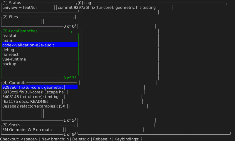
<Panel
  title="[3]-Local branches"
  footer={listCounter(selected, branches.length)}  // "3 of 7"
  footerAlign="right"
  focused={focus === 2}      // border turns green
  flexGrow={2}
>
  …
</Panel>
border defaults to "rounded"; focusedColor defaults to "green", and borderColor
is used when unfocused.
List
Controlled, scrollable, with a full-row highlight. Arrow keys, Home/End,
PageUp/PageDown, and clicking a row all move the selection; the viewport scrolls to
keep it visible.
<List
  items={branches}
  selectedIndex={selected}
  onSelect={setSelected}
  height={8}
  width="100%"
  selectedBackground="blue"
/>
Together with Panel and StatusBar that is the whole lazygit clone:
StatusBar
The docked keybinding row.
<StatusBar
  items={[
    { label: "Checkout", keyHint: "<space>" },
    { label: "Delete", keyHint: "d" },
  ]}
/>
// → "Checkout: <space> | Delete: d"
Focus
nextFocus is the pure helper behind panel focus: digits jump to a panel, Tab/Shift-Tab
cycle. The framework bindings wrap it — useFocusList in React, createFocusList in Solid.
const { focused, handleKey } = useFocusList(6);       // React
const { focused, handleKey } = createFocusList(6);    // Solid — focused() is an accessor
Content: Markdown, Code, Diff
<Markdown content="# Title\n\nSome **bold** text." width={60} />
<Code content={source} filename="server.ts" lineNumbers />
<Diff patch={unifiedDiff} language="typescript" />
Code infers the language from filename when language is omitted. Highlighting is real
(lowlight), and themes are SyntaxTheme objects.
StreamingMarkdown is for AI output: it splits the growing text into already-complete
blocks and the in-progress tail, so an arriving token only re-parses the tail rather than
the whole document.
<StreamingMarkdown content={partialResponse} width={60} />Scrolling, hovering, palettes
<ScrollView content={rows} height={20} width={60} />   {/* wheel + keys + scrollbar */}

<Hoverable>
  {(hovered) => <Text color={hovered ? "yellow" : undefined}>hover me</Text>}
</Hoverable>

<CommandPalette items={commands} query={query} selectedIndex={i} onSelect={run} />
In Solid, Hoverable's render-prop receives an accessor — hovered(), not hovered.
A plain boolean would be read once when the child is created and could never change.
VirtualList
Renders only the visible window, however many items there are.
<VirtualList
  items={tenThousandRows}
  height={20}
  renderItem={(item, i) => <Text>{item}</Text>}
/>